Friday, February 3, 2017
A Design Lesson Perfect Proportions ala Kathryn Ireland
A Design Lesson Perfect Proportions ala Kathryn Ireland
SORRY! I accidently posted this story after I had written a few paragraphs and had no clue I had done so! Thanks for being understanding. I’ve added a lot to this story, so if you read parts of it before, give it a second read!!

Interior Designer Kathryn “M” Ireland has put together a few How-To-Decorate short videos which she posts on her web site and instagram. I was watching them the other day – “How To Decorate With Accessories” – and I was struck by the way she designs.
Kathryn has a very casual style which has remained constant throughout the years:
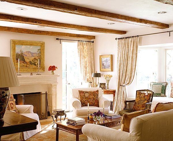
One of Kathryn’s first designs from decades ago.
A photo of a house decorated by her from the early 1990s is almost indistinguishable from a house she designed last year.

A brand new Ireland design.
Her classic style is part English Country Manor and part Southern Californian Beach. She uses antique furniture mixed with fabulously designed upholstered furniture, curtains, rugs, and piles of pillows.
Two of her How-To videos that I watched made me huge impact on me for a reason that I really don’t think much about – but, as a designer and blogger, should: Proportion.
The two videos were filmed in her showroom/studio where she has set up a large space like a drawing room, right next to a garage where 2 men create her hand screened fabrics! I had NO idea her fabrics were made right in her office!! I assumed they were hand-screened overseas in France or England. But, no. There, in her studio space, on an extended table – yards and yards of Belgian linen have cans of paint poured over them – thus creating her fabulous fabrics.
The showroom/studio space is relatively new. She moved here just a few years ago in order to consolidate all aspects of her work into one place: showroom, sales, shipping & receiving, sewing soft goods, and manufacturing her fabrics. The space was also created to double as a destination where she can entertain with both large and small events and it includes a small catering kitchen. It is also where she can host her very popular Design Camps.
On the showroom side, the ceilings are double height with skylights. The paneled walls are cream with gray stripes and a large, antique pink rug anchors the space. She has set it up as a drawing room, complete with a piano (she says every house needs three things, a sewing machine, a piano, and a piles and piles of books. OK, I am lacking two of her VIP items!!)
For the first How-To-Design-With-Pillows, she strips her large slipcovered sofa and creates different looks with different throws and pillows. But what struck me immediately and very viscerally was her innate sense of proportion. She sizes up a room and what it needs – without any ruler or rule. It’s all instinct and she never second guesses herself. It was amazing to watch her in action.
First she takes a cotton throw and folds it so that it just perfectly fits over the back of her slipped covered sofa. How many times have you fought with a throw and just gave up because you couldn’t get it right?
Katherine gets the proportion of the throw to the sofa just perfectly, the very first time.

Here is Kathryn putting on the throw. She has folded it perfectly so it fits – just so – and then she tucks it into the seat. And here is where the proportion comes in, she uses a throw that covers the entire back. If not, she folds a smaller one just so. The proportion is perfect.

In one video, she played around with different pillow combinations. She said – the large pillows should be on the corners – to anchor the sofa. Exactly. Very well put.
On pillows Kathryn says this: “A 24-inch and then a 21-inch, and then a bolster. It’s all about proportion.”
She also points out that the pillow fill is very important, especially the quality of the feathers. And you could see how wonderful her pillows were, soft and downy. On her web site, the covers come with the pillow and the fill is 90/10. The reasonable price is well worth the cost of the fill. Kathryn says to be sure to have the zipper on the hidden side. Look how perfect this arrangement is. It’s so Kathryn. It’s not about the fabrics, but the size and the fill. And, NO karate chop!! Just say no to the chop, she said.
I found this answer from Kathryn in an interview that told me I was on the right trail:
What turns you on in design?
”PERFECT PROPORTIONS.”

In the How-To video, she settled on this pillow choice with two large blue pillows, two smaller cream ones and a large pattern pillow in the middle. In the second video – How-To-Decorate-With-Accessories, she gets the showroom ready for a party – using accessories and flowers. In this photo, notice the lamps and the oil painting of Kathryn’s grandmother behind the sofa. Notice how tall the lamps are. The proportion is perfect. The painting is the exact correct size, just as the console is. There is no second guessing with Kathryn. It’s like she has an antenna in her brain that directs her. Then, notice the one large painting behind the sofa on the right side. Again, it’s the perfect scale and the composition is also perfect – contemporary mixed with the English Country Manor look. She flanks that sofa with two matching consoles with tall twin mirrors and two tall matching lamps. Just perfect.

From the video, the finished showroom, with the tables decorated for the party. You can see the back wall with the matching consoles and mirrors and lamps. To the right is another sofa from her upholstery collection, with its beautiful lines. I was just struck at how effortless it all was for her. She took a warehouse full of pillows, accessories and chairs and art – and she pulled it all together. The size of the paintings and lamps and the mirrors – are perfect. They are large, but not comical. They fit the tall ceilings. The paintings and lamps and mirrors all came from Kathryn’s Santa Monica home which she recently sold.
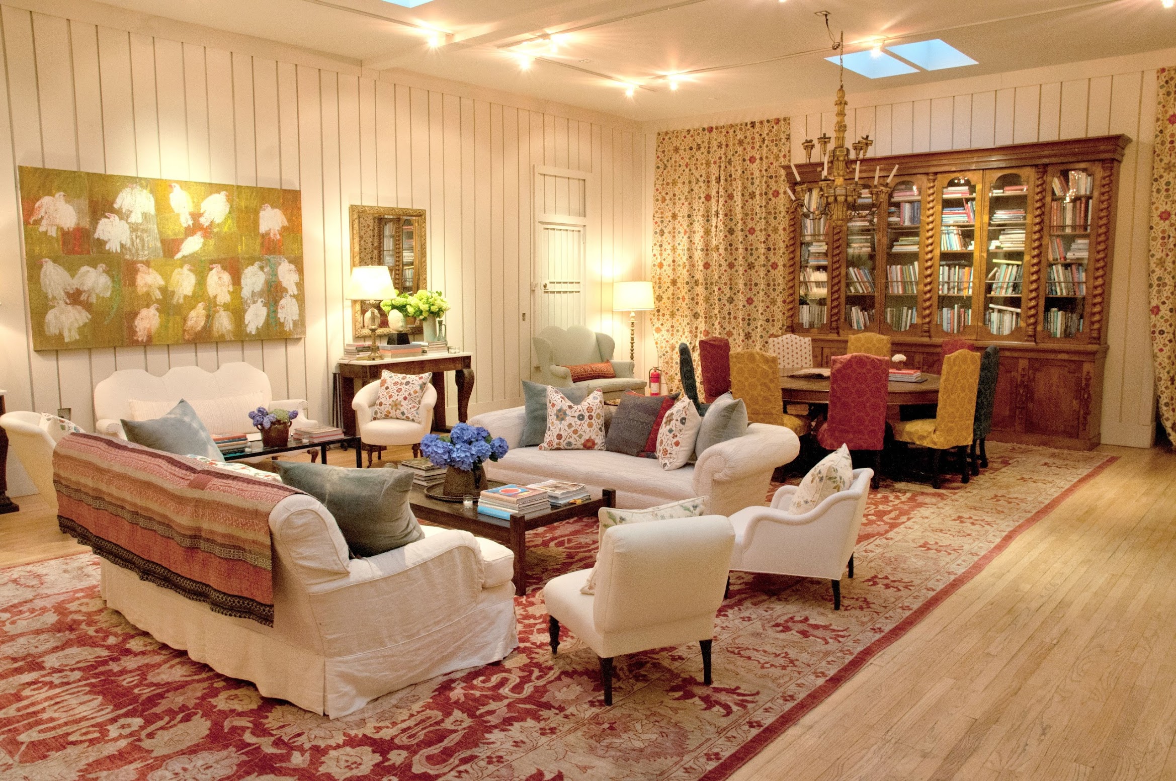
And for a party, Kathryn accessorized the main salon this way, with a few different tables and pillows. The porteries hide the office areas which also doubles as the dining room.

The dining room in the studio set for a dinner party.

Here, in another photograph taken earlier – you can see how it was once decorated. Again, the proportion of the large bookcase against the wall is perfect. So is the size of the chandelier. These two chairs were once in Kathryn’s living room.

Another view – of how is was with tapestries on the wall.

In the How-To-Make-Handscreened-Fabric video, Kathryn takes us through her showroom filled with her fabrics. Here she shows us her most popular fabric – ever – Suzani. It takes 12 screens to print it because there are 12 colors in it.

Here are the long, extended tables that the fabric lies on. The screen is on top of it with the color poured onto it. This reminds me of the story that Hillary Clinton told during the election – of her father working in his factory printing fabrics on long tables with screens!!
This video of the print process is really worth watching – I’ll link all the videos at the end of this story.

And here are the different screens for all her different fabrics. It’s amazing that she learned how to do this lost art – and that she makes her fabric right here in Los Angeles! I always assumed the fabrics were made in Belgium or France, but no, they are made in this very humble factory, with just two men working a screen with paint on it.

Additionally, there is a small catering kitchen with not one, but TWO red AGAs. As a spokesman for AGA, this makes perfect sense.

The first time I really came to see how wonderfully Kathryn used proportions was during the filming of Bravo’s Million Dollar Decorators. Why did Bravo ever cancel that fabulous show??? This Dallas bedroom was decorated using items that Houston’s Chateau Domingue’s Ruth Gay had driven up to Dallas in a huge truck. Oh to die for that truck to come to my house!!! Anyway – Kathryn redid this bedroom using a fabulous oversized antique map that was just the perfect size. Another item was the bench at the end of the bed – overscaled but perfect for this large room that had been underfurnished. The pillows on the bed were just perfect. This was probably my favorite redo that Kathryn did on the Bravo show mainly because of the quality of furnishings brought to Dallas by Gay.

Here is a house Kathryn did for a client which again shows her perfect sense for proportions. Two large sofas, one with a textile on its back, flank a large mantel. Over the mantel, she placed a round shape, which is a right foil to all the large rectangles in the room. The striped rug is bold enough to accent the white sofas. I love her lamps flanking the fireplace – with the red shades – large enough to make a statement and become the focal point. I love this room! It’s a favorite.
Apparently Kathryn has been making some big changes.
She moved to her new studio space in 2014, creating out of its 8,000 sq ft., a space for all her work endeavors. The studio is now listed for sale. Another change involved her vacation house.

Years ago, Kathryn bought a farmhouse in the south of France. Some time ago, Kathryn surprisingly bought a ranch in Ojai thinking she would sell her French farmhouse and would consolidate her life in California. She redid the ranch and published one of her most popular books about the renovation.
But, Kathryn’s three boys objected to the sale of her French farm, so she sold the Ojai ranch to Reese Witherspoon instead.

Kathryn’s large living room in the Ojai ranch showed off her perfect sense of proportion. A tall Spanish painting graced the mantel and flanking it were cords of firewood.

Kathryn has spent every summer for almost 25 years at her farmhouse, La Castellane in France. She has entertained all her friends and family there, including once having Barbra Streisand and Robert DeNiro. She also hosted a series of successful design/yoga retreats there.

Last year or so, it was announced in articles and Architectural Digest that her French farm was for sale. In an interview, Kathryn revealed there was a property in her Scottish hometown that she was very interested in. But, since then, nothing else was said of the farmhouse sale and the French house appears to be still be hers. No recent word about her moving to Scotland either. This summer, she again hosted her yoga/design retreats in France.
And then there is Kathryn’s famous Santa Monica house, where so many photoshoots for magazine articles occurred. The house was totally Kathryn, a laboratory which she often changed to show off her latest fabric collections and professional associations like the one with AGA. Two years ago, with her three sons now grown – and so handsome! – she sold the Santa Monica house and moved to a soft contemporary house in Venice. The new house appeared in her latest book and a few magazine articles. But, apparently, she has already moved on from that new house – it very recently sold. Lots of changes! I think all of us go through this when our nests are suddenly empty. Statistically it is said that second houses last ten years. Her French farmhouse has alaready lasted over 25.
For old times sakes, here’s a look at her old Santa Monica house, where the real estate photos show tons of rooms rarely seen. It’s interesting to see how much the decor has changed through the years. And, then we’ll look at her new house!

The facade of the Santa Monica house has completely changed over the years. Originally, the 1920s Spanish house had bright blue shutters and a grass filled front yard bordered by a white picket fence.

Later, the shutters were painted a soft French blue. The grass was removed to make the front yard a gravel filled courtyard. In the center of the new garden, a tiled fountain with a turquoise urn became the focal point of the front facade.

The front courtyard with the newly installed Spanish fountain. The ground is gravel, with seating areas made up of Kubu chairs. Upstairs, the bedroom with a window box with orange flowers and French blue shutters overlooks the courtyard. Besides installing the new front garden, Kathryn removed the window in the front window that leads to the living room and installed a French door, thereby facilitating the indoor outdoor feel of the house.

Another front view of the new fountain, with a bench piled high with Kathryn’s fabric pillows. Through the French doors – you can now enter into the living room.

